DataHub React App
About
This module contains a React application that serves as the DataHub UI.
Feel free to take a look around, deploy, and contribute.
Functional Goals
The initial milestone for the app was to achieve functional parity with the previous Ember app. This meant supporting
- Dataset Profiles, Search, Browse Experience
- User Profiles, Search
- LDAP Authentication Flow
This has since been achieved. The new set of functional goals are reflected in the latest version of the DataHub Roadmap.
Design Goals
In building out the client experience, we intend to leverage learnings from the previous Ember-based app and incorporate feedback gathered from organizations operating DataHub. Two themes have emerged to serve as guideposts:
- Configurability: The client experience should be configurable, such that deploying organizations can tailor certain aspects to their needs. This includes theme / styling configurability, showing and hiding specific functionality, customizing copy & logos, etc.
- Extensibility: Extending the functionality of DataHub should be as simple as possible. Making changes like extending an existing entity & adding a new entity should require minimal effort and should be well covered in detailed documentation.
Starting the Application
Quick Start
Navigate to the docker directory and run the following to spin up the react app:
./quickstart.sh
at http://localhost:9002.
If you want to make changes to the UI see them live without having to rebuild the datahub-frontend-react docker image, you
can run the following in this directory:
yarn install && yarn run start
which will start a forwarding server at localhost:3000. Note that to fetch real data, datahub-frontend server will also
need to be deployed, still at http://localhost:9002, to service GraphQL API requests.
Optionally you could also start the app with the mock server without running the docker containers by executing yarn start:mock. See here for available login users.
Testing your customizations
There is two options to test your customizations:
- Option 1: Initialize the docker containers with the
quickstart.shscript (or if any custom docker-compose file) and then runyarn startin this directory. This will start a forwarding server atlocalhost:3000that will use thedatahub-frontendserver athttp://localhost:9002to fetch real data. - Option 2: Change the environment variable
REACT_APP_PROXY_TARGETin the.envfile to point to yourdatahub-frontendserver (ex: https://my_datahub_host.com) and then runyarn startin this directory. This will start a forwarding server atlocalhost:3000that will use thedatahub-frontendserver at some domain to fetch real data.
The option 2 is useful if you want to test your React customizations without having to run the hole DataHub stack locally. However, if you changed other components of the DataHub stack, you will need to run the hole stack locally (building the docker images) and use the option 1.
Functional testing
In order to start a server and run frontend unit tests using react-testing-framework, run:
yarn test :e2e
There are also more automated tests using Cypress in the smoke-test folder of the repository root.
Troubleshooting
Error: error:0308010C:digital envelope routines::unsupported: This error message shows up when using Node 17, due to an OpenSSL update related to md5.
The best workaround is to revert to the Active LTS version of Node, 16.13.0 with the command nvm install 16.13.0 and if necessary reinstall yarn npm install --global yarn.
Theming
Customizing your App without rebuilding assets
To see the results of any change to a theme, you will need to rebuild your datahub-frontend-react container. While this may work for some users, if you don't want to rebuild your container you can change two things without rebuilding.
- You customize the logo on the homepage & the search bar header by setting the
REACT_APP_LOGO_URLenv variable when deploying GMS. - You can customize the favicon (the icon on your browser tab) by setting the
REACT_APP_FAVICON_URLenv var when deploying GMS.
Selecting a theme
Theme configurations are stored in ./src/conf/theme. To select a theme, choose one and update the REACT_APP_THEME_CONFIG env variable stored in .env.
To change the selected theme, update the .env file and re-run yarn start from datahub/datahub-web-react.
Editing a theme
To edit an existing theme, the recommendation is to clone one of the existing themes into a new file with the name <your_themes_name>.config.json,
and then update the env variable as descibed above. The theme files have three sections, styles, assets and content. The type of the theme configs is specified
in ./src/conf/theme/types.ts.
styles configure overrides for the apps theming variables.
assets configures the logo url.
content specifies customizable text fields.
While developing on your theme, all changes to assets and content are seen immediately in your local app. However, changes to styles require
you to terminate and re-run yarn start to see updated styles.
Design Details
Package Organization
The src dir of the app is broken down into the following modules
conf - Stores global configuration flags that can be referenced across the app. For example, the number of search results shown per page, or the placeholder text in the search bar box. It serves as a location where levels for functional configurability should reside.
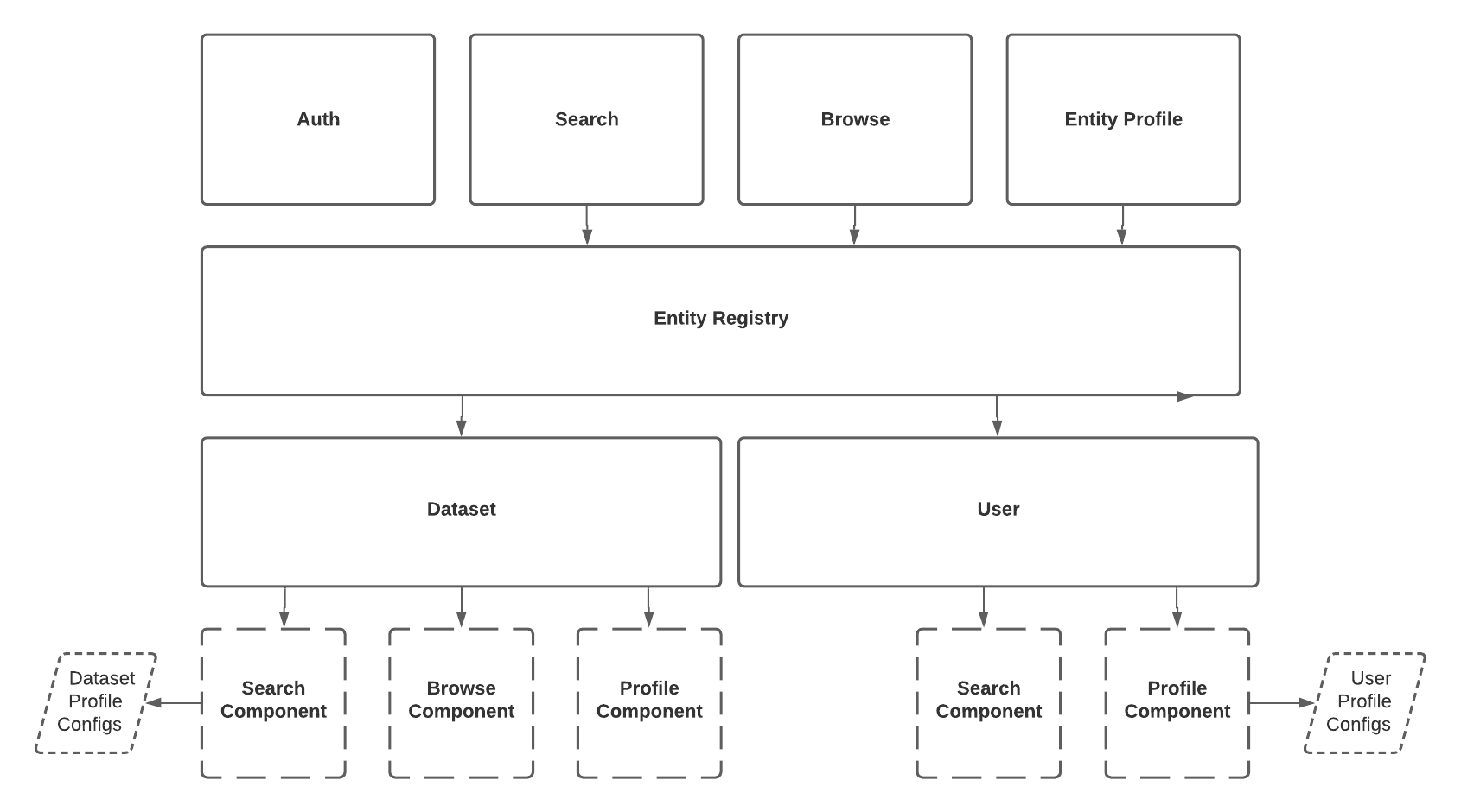
app - Contains all important components of the app. It has a few sub-modules:
auth: Components used to render the user authentication experience.browse: Shared components used to render the 'browse-by-path' experience. The experience is akin to navigating a filesystem hierarchy.preview: Shared components used to render Entity 'preview' views. These can appear in search results, browse results, and within entity profile pages.search: Shared components used to render the full-text search experience.shared: Misc. shared componentsentity: Contains Entity definitions, where entity-specific functionality resides. Configuration is provided by implementing the 'Entity' interface. (See DatasetEntity.tsx for example) There are 2 visual components each entity should supply:profiles: display relevant details about an individual entity. This serves as the entity's 'profile'.previews: provide a 'preview', or a smaller details card, containing the most important information about an entity instance.When rendering a preview, the entity's data and the type of preview (SEARCH, BROWSE, PREVIEW) are provided. This allows you to optionally customize the way an entities preview is rendered in different views.
entity registry: There's another very important piece of code living within this module: the EntityRegistry. This is a layer of abstraction over the intimate details of rendering a particular entity. It is used to render a view associated with a particular entity type (user, dataset, etc.).
graphql - The React App talks to the dathub-frontend server using GraphQL. This module is where the queries issued
against the server are defined. Once defined, running yarn run generate will code-gen TypeScript objects to make invoking
these queries extremely easy. An example can be found at the top of SearchPage.tsx.
images - Images to be displayed within the app. This is where one would place a custom logo image.
Adding an Entity
The following outlines a series of steps required to introduce a new entity into the React app:
Declare the GraphQL Queries required to display the new entity
- If search functionality should be supported, extend the "search" query within
search.graphqlto fetch the new entity data. - If browse functionality should be supported, extend the "browse" query within
browse.graphqlto fetch the new entity data. - If display a 'profile' should be supported (most often), introduce a new
<entity-name>.graphqlfile that contains agetquery to fetch the entity by primary key (urn).
Note that your new entity must implement the
EntityGraphQL type interface, and thus must have a correspondingEntityType.- If search functionality should be supported, extend the "search" query within
Implement the
Entityinterface- Create a new folder under
src/components/entitycorresponding to your entity - Create a class that implements the
Entityinterface (example:DatasetEntity.tsx) - Provide an implementation each method defined on the interface.
- This class specifies whether your new entity should be searchable & browsable, defines the names used to identify your entity when instances are rendered in collection / when entity appears in the URL path, and provides the ability to render your entity given data returned by the GQL API.
- Create a new folder under
Register the new entity in the
EntityRegistry- Update
App.tsxto register an instance of your new entity. Now your entity will be accessible via the registry and appear in the UI. To manually retrieve the info about your entity or others, simply use an instance of theEntityRegistry, which is provided viaReactContextto all components in the hierarchy. For exampleentityRegistry.getCollectionName(EntityType.YOUR_NEW_ENTITY)
- Update
That's it! For any questions, do not hesitate to reach out on the DataHub Slack community in #datahub-react.